
Streamline your email creation process with our efficient inline editor in Email Builder for Templates and Campaigns. This tool offers a dynamic and user-friendly experience, ensuring quality output with increased speed and convenience.
The Email Builder Inline Editor is a powerful tool embedded within our Templates and Campaigns platform that allows you to create and customize emails with unprecedented efficiency and ease. It presents a user-friendly interface that eliminates the complexity of email design and formatting.
The Email Builder Inline Editor leverages the “What You See Is What You Get” (WYSIWYG) editing principle. Imagine you’re drafting an email, and you decide to bold a sentence, insert an image after a paragraph, or change the color of a heading. As you make these changes in the editor, they are immediately reflected, just as they appear in the final email. This gives you a real-time preview and a straightforward editing experience, helping you to create better emails more efficiently.
This robust tool supports various customization features, allowing you to style your email content using multiple headings and paragraph formats. You can choose from a selection of supported fonts, apply different text sizes ranging from 8px to 96px, and color your text using hex code for precise color selection. You can also apply text formatting such as bold, italic, underline, and strikethrough, or add hyperlinks for redirection.
Moreover, the inline editor allows for custom values, giving you better control over your content. The tool also supports AI-assisted content generation, which can help you create engaging email content faster.

Please Note: To maintain uniformity in the structure of your emails, we have implemented a default padding update. You now can manage the spacing around your content. Please be aware that the default settings for padding are as follows:
Top Padding: 12
Bottom Padding: 12
Left Padding: 24
Right Padding: 24

Upon accessing the Email Builder, you will be greeted by a sleek, intuitive user interface. On the top, you will find a toolbar with different functionalities:


Lastly, the ‘Appearance’ setting lets you control the global style of your email, including things like background color, Divider, Custom CSS styling, and Mobile Formatting.

These functionalities are designed to give you complete control over your email’s design, from the individual components to the overall look and feel.

Here’s a detailed explanation of each layout:
1: This layout represents a single-column structure. All content is placed in one straight vertical line. This is the most basic and one of the most common layouts used in emails. It’s great for readability, especially on smaller screens such as mobile devices.
2: This layout corresponds to a two-column structure. Your email content is divided into two vertical columns. This layout is ideal for displaying two groups of content side by side, like an image and a text block or two articles from an RSS feed.
1/3: 2/3 and 2/3 : 1/3: These layouts represent a structure where the content is divided into two unequal columns. In 1/3: 2/3, one column takes up 1/3 of the width, and the other takes up 2/3. It’s reversed in the 2/3: 1/3 layout. These are great for highlighting one piece of content more than the other, like an image and an accompanying description where the image is the main focus.
1/4: 3/4 and 3/4 : 1/4: Similar to the above, but here one column takes up 1/4 of the space, and the other takes up 3/4, and vice versa. This layout is useful when one piece of content is significantly more important than the other, such as a small navigation menu alongside a large content area.
4: This layout refers to a four-column structure. Your email content is split across four equal vertical columns. This is useful for presenting multiple pieces of content of equal importance side by side, like a grid of images or multiple articles from an RSS feed.
These layouts offer various ways to structure and present your content, depending on your specific needs and the type of email you’re sending. By understanding the different options, you can choose the most effective layout for your email.
To add any of these elements to your email, drag and drop them onto your canvas. When you select an element for editing, the Inline Editor will pop up, providing numerous options to modify your chosen element to fit your requirements.
Here is a comprehensive list of content types you can add to your email:
Text: This versatile element can be used for headings, paragraphs, captions, and more. With the inline editor, you can fine-tune every text aspect, from the font style to the color and alignment.

Image: If you want to include photos, graphics, or any other visual content, the Image element is the tool you need. You can upload images directly from your computer or link them from an external source.

Button: Enhance user interaction with the Button element. You can link to a webpage, start a download, or trigger any other click-based action.
Note: Enter the text you want to display on your button. For instance, you might use ‘Follow Me’ to invite readers to follow a link to your social media page
Divider: The Divider element allows you to introduce clear separations between different sections of your email. Customize the color, width, and style to fit your design.
Social: Want your recipients to visit your social media profiles? The Social element lets you easily include icons linked to various social media platforms.
Footer: Use the Footer element to include essential information like contact details, company address, or unsubscribe links.
Code: Need more advanced features? The Code element allows you to insert custom HTML code directly into your email. This is where you input your custom code. This allows you to create more advanced layouts and components within your email.
Note: The Code block is intended for users who are proficient in HTML. As a precaution, we recommend familiarizing yourself with the essentials of HTML before using this feature. For guidance, you might find these resources helpful:
https://www.w3schools.com/html…
https://www.codecademy.com/lea…
Video: Engage your recipients with multimedia content. Insert a Video element and link it to your hosted video content.
Shopping Cart: If you’re in the e-commerce industry, the Shopping Cart element is a handy tool for including product details, pricing, and direct links to your online store. It’s a way to remind them of the products they’re interested in and encourage them to finalize their purchases.
RSS Header: The RSS Header block in the email builder is a powerful tool that allows you to dynamically populate the <channel> tags from your RSS Feed in your email campaign.
RSS Items: When dealing with RSS feeds, the “RSS Items” element is a crucial part of an email builder in email marketing platforms. It essentially works as a dynamic content placeholder that populates content from the RSS feed into your email campaign. The RSS items can range from blog posts, news updates, articles, or any published content accessible through an RSS feed.
An inline editor is a powerful tool that lets you easily manage text and its formatting. When you highlight any portion of text, a range of options becomes available in the editor.
You can change the heading type.
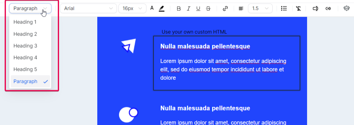
Select a different font, adjust font size, and modify the text color


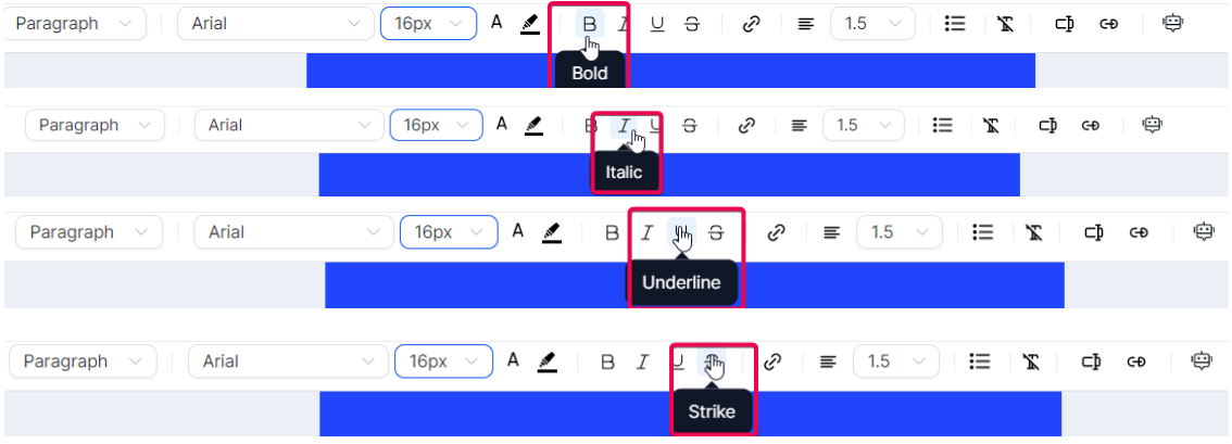
It doesn’t end there – options for bold, italic, underline, and strikethrough are also available
If you wish to add a hyperlink to your text, the inline editor allows you to do so, giving you control over its display text and target URL


You can also adjust text alignment and line height or introduce bullet points to your text.

The inline editor also comes equipped with advanced editing options. The ‘Clear Format’ feature lets you strip any existing formatting from a section of the text, a handy tool when pasting text from external sources.

Custom values: They bring a personalized touch to your emails by incorporating specific recipient details such as their name or location. This personalization can improve your email’s relevance to each recipient, thereby improving engagement rates.

Trigger links: They allow recipients to perform certain actions directly from the email, such as confirming a subscription, unsubscribing, or accessing a special offer. These interactive elements can drive engagement and boost conversions by simplifying user actions.

Moreover, the ‘ContentAI’ feature leverages artificial intelligence to help generate text content. The tool can automatically generate relevant text content for you by providing content titles, descriptions, and keywords.


The ‘Manage Elements’ function gives you control over each element within your email. Selecting an element in this section allows you to modify its visibility for different devices – desktop, mobile, or both.

Visibility settings allow you to control how certain elements appear on different devices. Specifically, “mobile visibility” and “desktop visibility” settings allow you to choose which elements of your email or webpage should be displayed when viewed on a desktop or mobile device.
Mobile Visibility refers to how your email or webpage elements appear on mobile devices like smartphones or tablets. Given the smaller screen sizes of these devices, you might opt to hide certain elements that don’t display well or simplify your content for easier mobile consumption. It can also involve restructuring or resizing elements for a more mobile-friendly layout.

Desktop Visibility refers to how your email or webpage elements are viewed on desktop devices. Since desktop screens are larger and provide more space, you can include additional elements that wouldn’t fit well on a mobile screen. Also, elements that require hover actions, which are not applicable on mobile devices, can be displayed.

Moreover, each element can be edited independently, allowing you to change its properties.

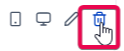
You can remove an element from the ‘Manage Elements’ section if it doesn’t fit into your email.
Whenever you hover over and click a section, column, or element in the Manage Elements section, the screen scrolls to the section, column, or element you are hovering your cursor over.

The ‘Appearance’ function is your go-to place for tweaking your template’s look and feel.

Template
Here you can choose the color scheme for your template, upload a background image, and even define the width of your email’s content.
Button:
The “Button” section in the appearance settings allows you to design and stylize action-oriented buttons for interactive and engaging emails.
Divider:
The “Divider” section in the appearance settings lets you incorporate customized lines for structuring and segregating email content.
Custom CSS:
The “Custom CSS” section allows you to add CSS styles to customize your email layout further. However, this requires a good understanding of CSS and its implications in email design. CSS in emails works slightly differently than in web design due to the variety of email clients and their rendering capabilities.
Here are a few resources that can help you get started with CSS:
CSS Tricks: https://css-tricks.com/
Litmus: https://litmus.com/blog/catego…
Smashing Magazine: https://www.smashingmagazine.c…
MDN Web Docs: https://developer.mozilla.org/…
Email Design Workshop: CSS in Email: https://emaildesign.beefree.io…
Can I email…: Like Can I use… but for email: https://www.caniemail.com/
A great resource for checking which CSS properties and HTML elements are supported by major email clients.
In today’s world, it’s important that your emails look good on all devices. With that in mind, the Email Builder Inline Editor provides a special section for mobile formatting.
Here, you can specify which headings, paragraphs, and buttons should be visible when your email is viewed on a mobile device. This ensures that your emails are optimized for both desktop and mobile viewing.
When configuring mobile emails, you need to pay close attention to a few key areas that contribute to the overall usability and effectiveness of your emails:
Remember, the best practices for mobile email configuration may vary depending on your specific audience and the type of content you’re sending. Always test different approaches to see what works best for your audience.
Here are some resources that could help further consolidate the mobile email design best practices:
Mobile Email Design Further Reading: https://www.emailonacid.com/bl…
Utilizing Colors in Email Design Further Reading: https://www.creativebloq.com/i…
Optimize Images for Mobile Use Further Reading: https://www.sendinblue.com/blo…
Tips for CTA Design Further Reading: https://unbounce.com/email-mar…
Best Use of Space Further Reading: https://stripo.email/blog/emai…
Best Use of Scroll Further Reading: https://www.campaignmonitor.co…
Is A/B Testing Emails Necessary? Further Reading: https://sendpulse.com/blog/ab-…
Accessibility Guidelines for Emails Further Reading: https://www.emailonacid.com/bl…
Mobile-friendly Vs. Responsive Email Design Further Reading: https://litmus.com/blog/unders…
Mobile Email Configuration Best Practices Further Reading: https://www.mailup.com/resourc…
A: You can utilize the A/B testing feature, which is supported in the email builder. This allows you to test different email components, such as subject lines, content, and CTAs, to see what resonates with your audience.
A: Use the “Restaurant Generic” template. This offers a variety of layouts suitable for showcasing new dishes.
A: The “Legal Minds” or “Justice Law Firm” templates are useful. They are professional and perfect for showcasing services.
A: Use the “Helping Hand Charity” or “Giving Back Foundation” templates to create compelling messages about your cause and the importance of donations.
A: The “Physical Therapy” templates are designed for sharing health tips and exercise information.
A: Use the “Accurate Accounting Agency” or “Accounting Generic” templates. They are perfect for sharing financial tips and advice.
A: You can use any of the “Real Estate” templates. Each offers a professional layout for showcasing properties.
A: The “Radiance Beauty” or “Hair Salon Generic” templates would be perfect. They are designed to highlight beauty services and offers.
A: The “Pinnacle Travel” and “Getaways Travel” templates are designed to showcase travel packages.
A: The “Dentist” templates are designed for dental practices.
A: Use any “Yoga Generic” or numbered “Yoga” templates. They are perfect for sharing class schedules and health tips.
A: You can use the “Auto Repair” templates to promote your services and offers.
A: You should consider using any of the “Gym” templates. They are designed specifically for fitness-related content.
A: The “Holistic Wellness Image Layer Generic” template would be an excellent choice. It’s perfect for wellness tips and advice.
A: The “MedSpa” templates are designed for showcasing treatments and offers in a Medspa.
A: The “Landscaping Image Layer Generic 1” template offers a professional layout for showcasing landscaping work and services.
A: Use the “Credit Score” templates. They are specially designed for sharing financial advice and tips.
A: The “Solar Generic” or numbered “Solar” templates are ideal for showcasing solar products and services.
A: You can use the “Attorney Generic” or “Legal Minds” templates for sharing legal advice and updates.
A: Use the “Peak Climbing” template to showcase your climbing classes and training sessions.
A: The “Dog Shelter” and “Cat’s Cradle” templates are perfect for promoting pets available for adoption.